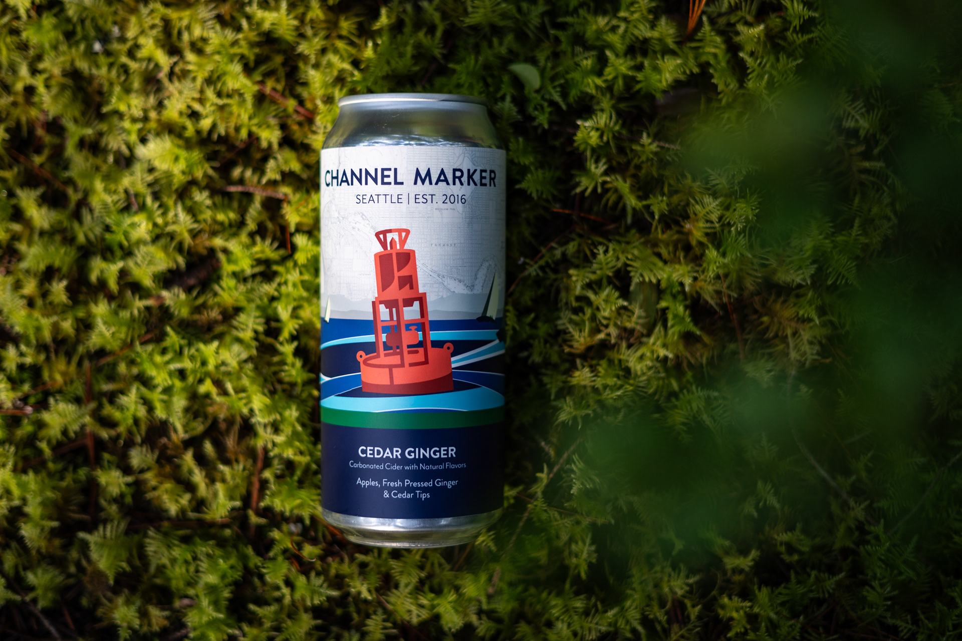
The Channel Marker label system is built to be flexible yet unmistakable, expanding (pardon the pun) or contracting depending on whether a cider is part of our core lineup or a seasonal/special release.
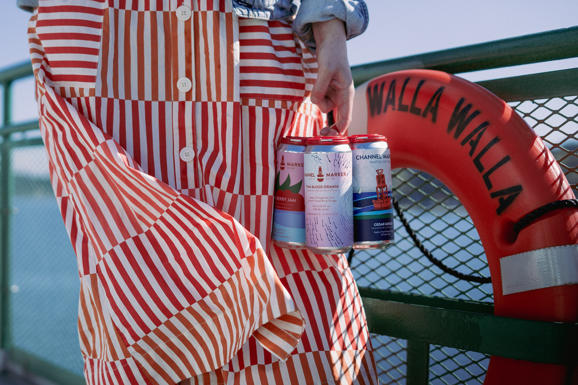
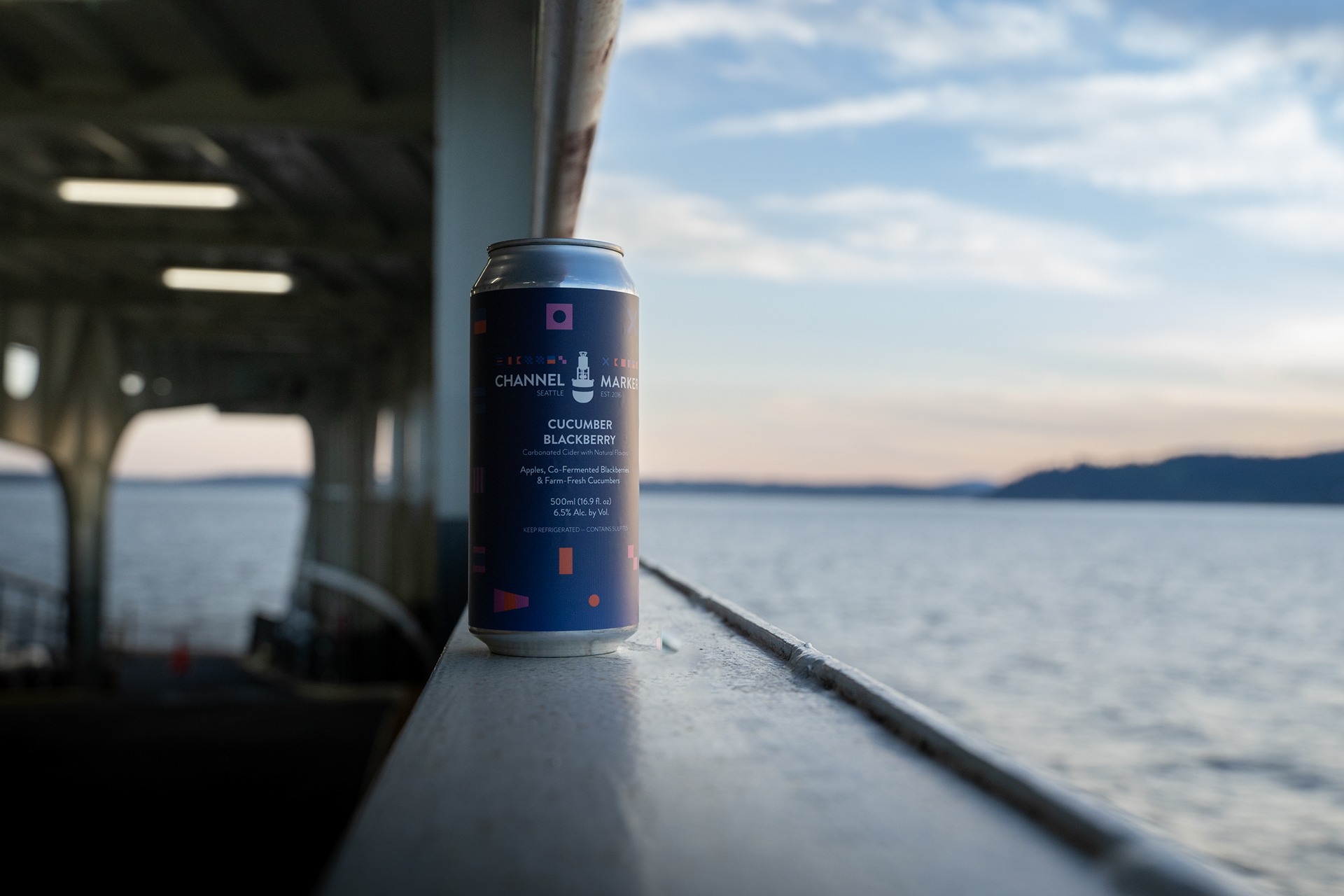
Our core ciders adhere to a consistent design structure, ensuring brand recognition across flavors. The key differentiator? A bold band of color that wraps around the label. When stacked side by side on a shelf, these bands create a continuous stripe of color, breaking the visual monotony and demanding attention from passersby.
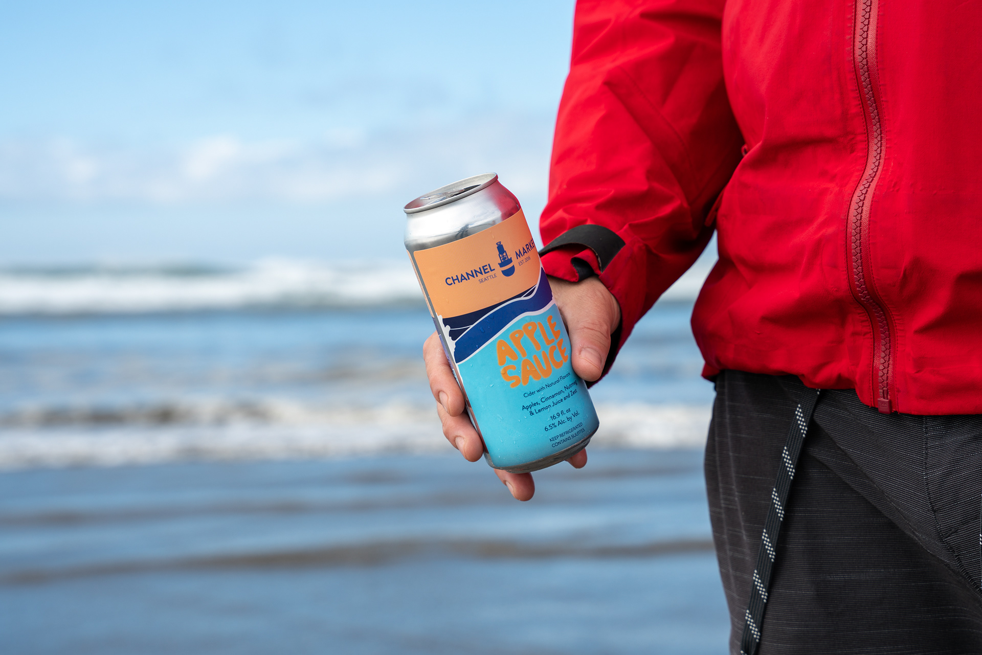
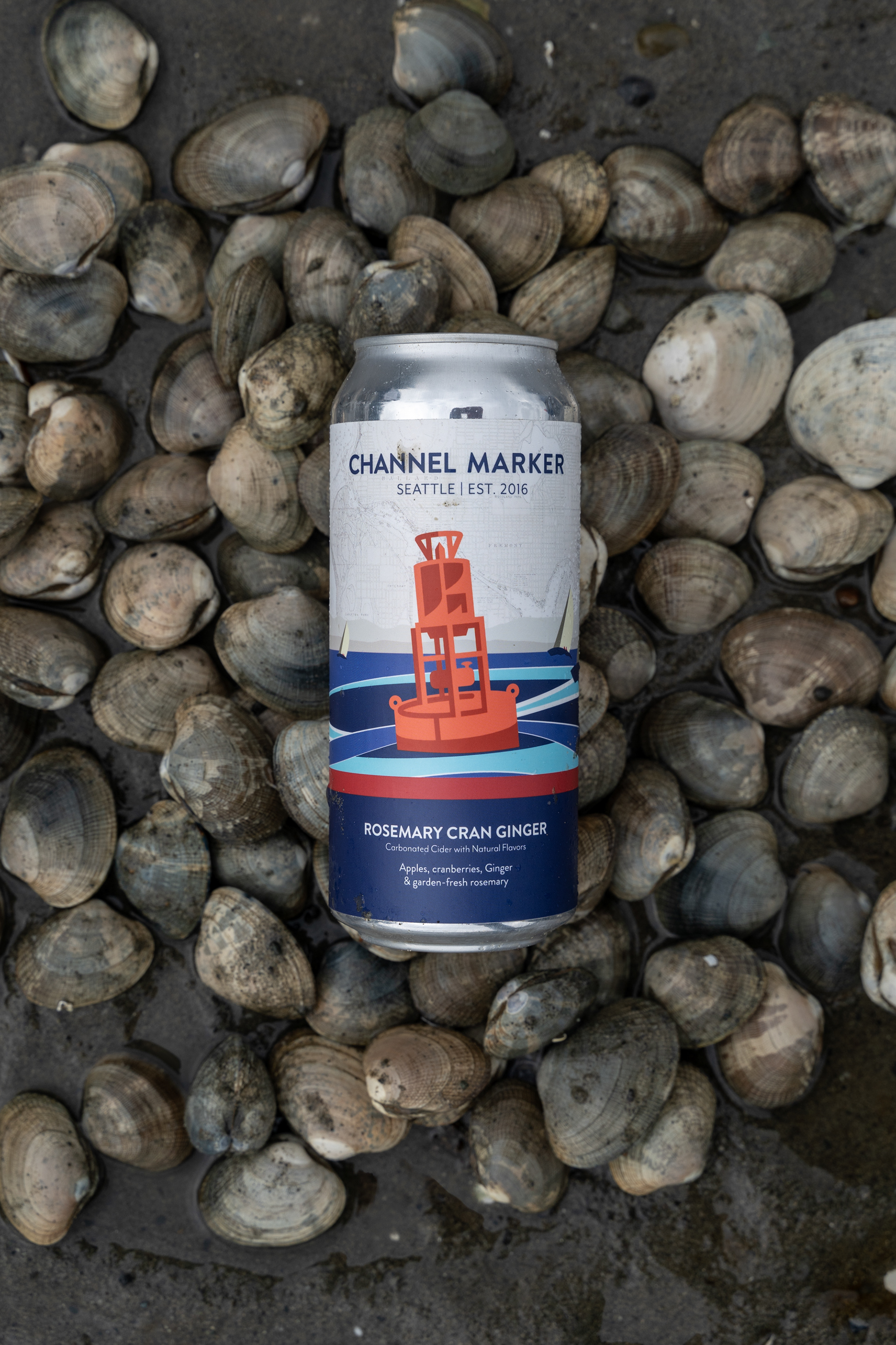
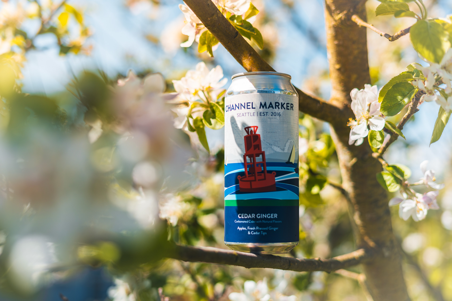
Our seasonal and special releases lean into a more expressive approach, still rooted in color-blocked vector imagery that keeps the design clean, modern, and impossible to ignore. They stand out without relying on loudness, just smart, intentional design choices that cut through the visual clutter of the cider aisle.
The balance is intentional: fun, but refined. Playful, but serious. Something that feels just as at home on a casual afternoon as it does on a well-set dinner table. It’s artwork for any occasion, but it’s best enjoyed on the water.