Taproom grand opening video

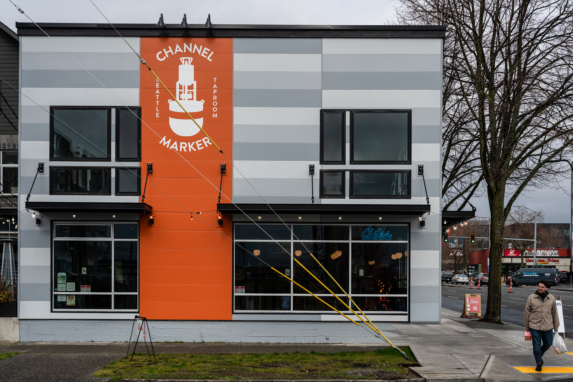
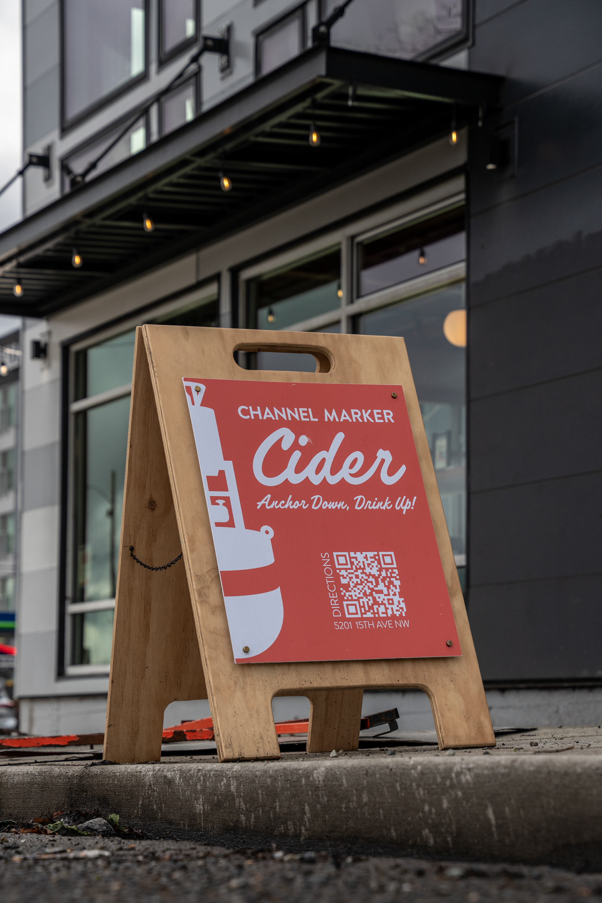
Designing the Channel Marker Taproom was a creative challenge with some sharp edges. The biggest? Budget. We had just enough to open the doors. no frills, no extravagance, just the minimal viable product. But beyond that, the goal was to craft a space that felt unique, comfortable, and undeniably Channel Marker.
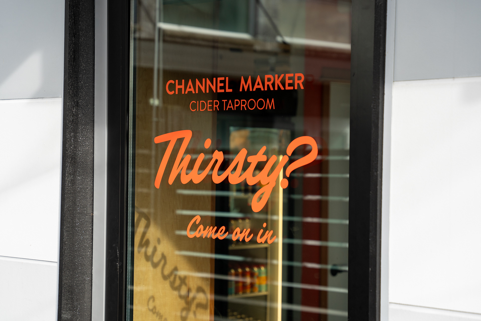
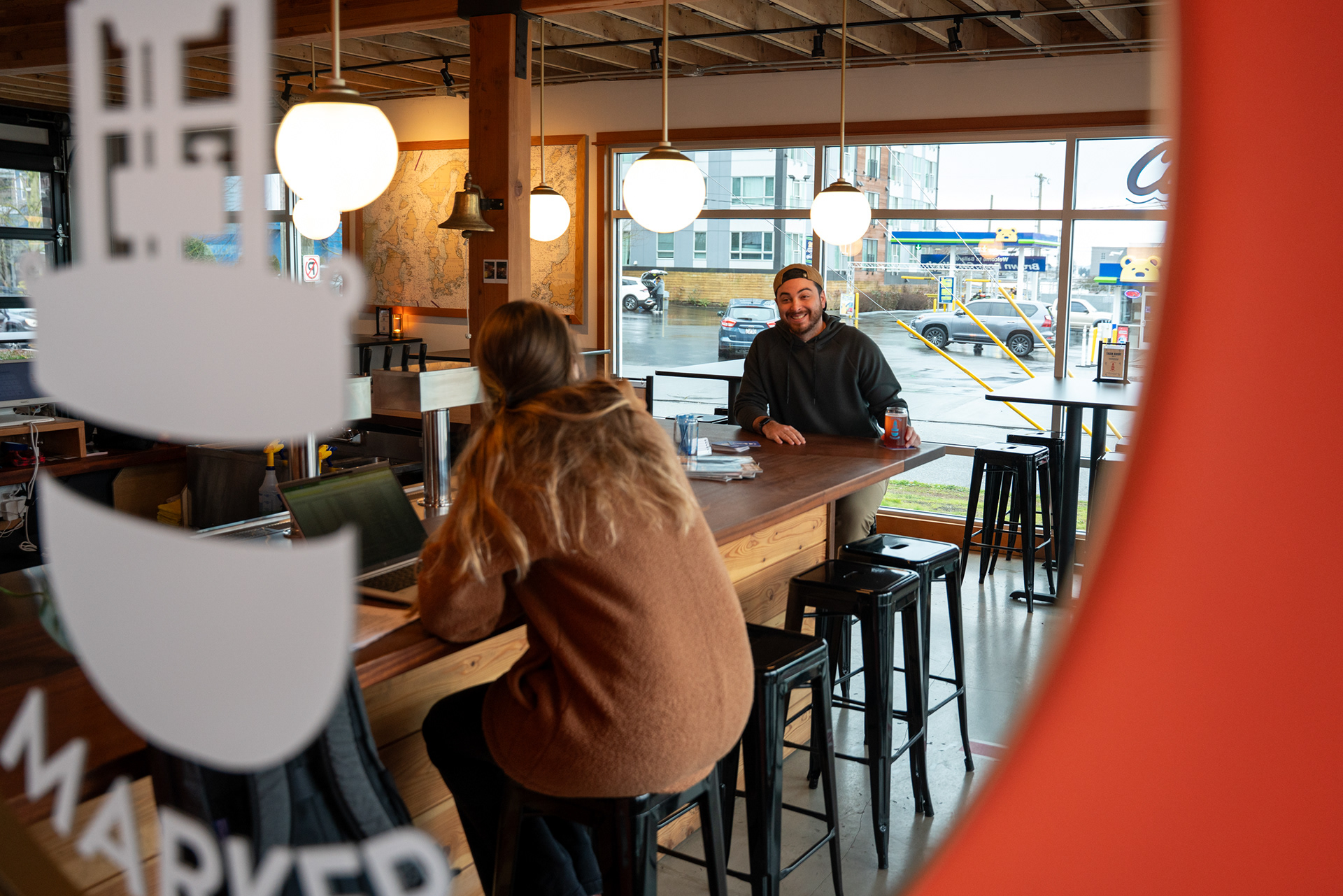
Since before we launched the cidery in 2016, I’ve kept notes on the third places that draw people in, bars, libraries, cafes, anywhere people naturally gather and feel at home. This helped shape our vision, but the taproom also had to function seamlessly as a bar. It needed to be welcoming to everyone, from cider lovers to four-legged friends, babies, and the ones footing the bill.
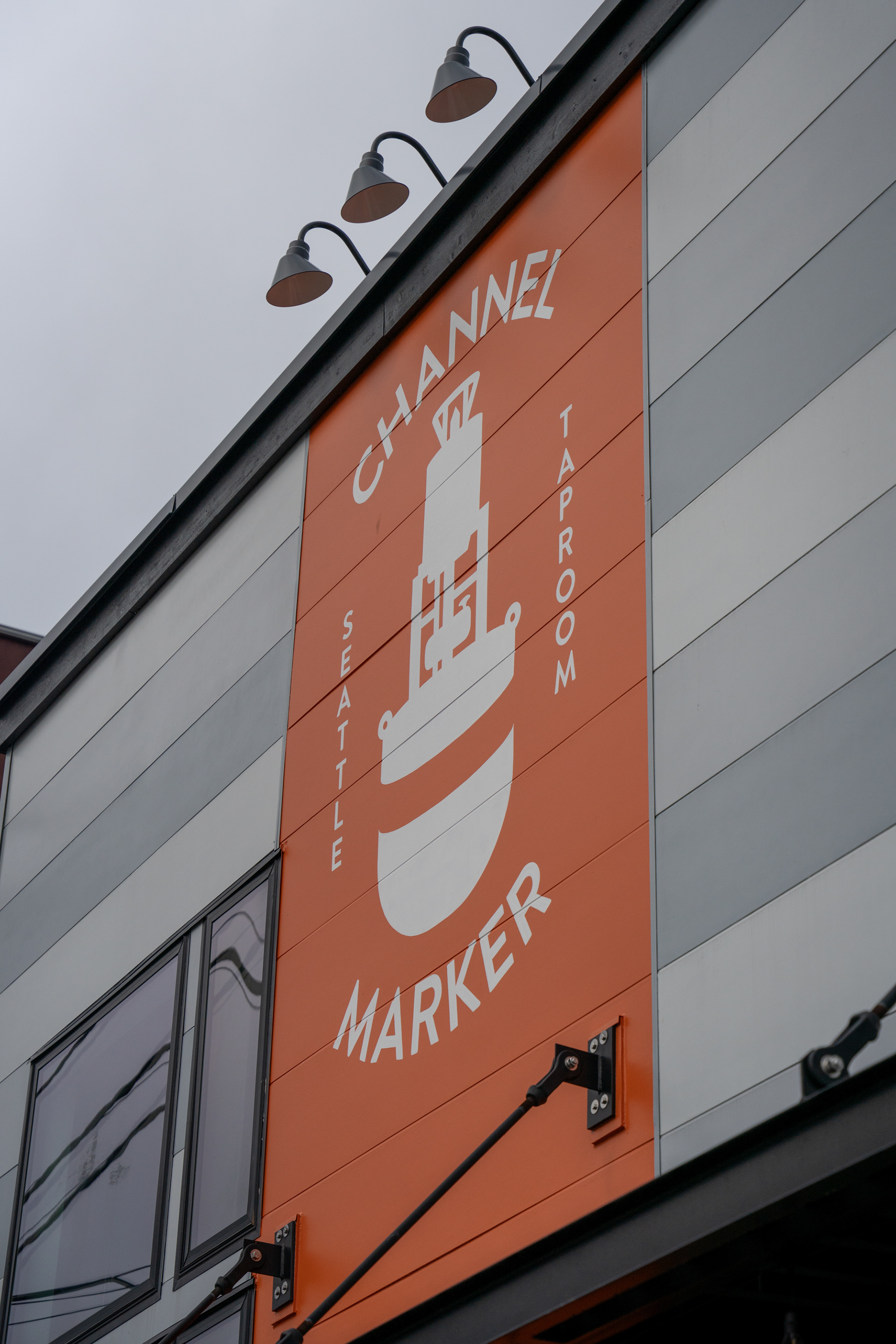
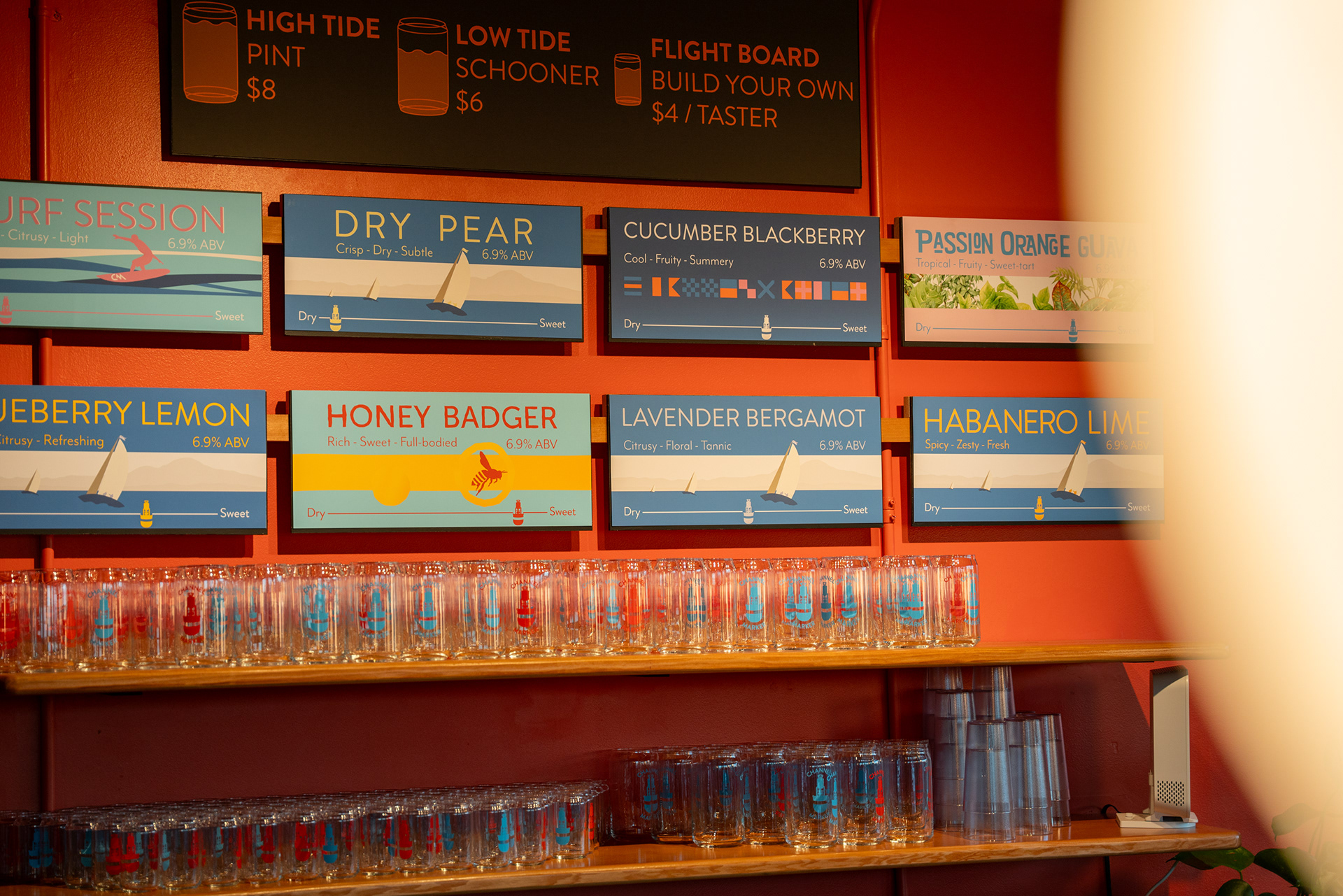
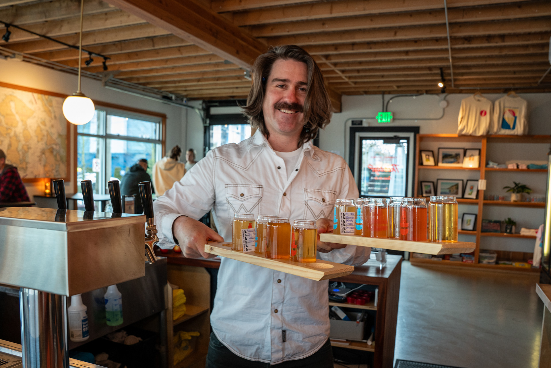
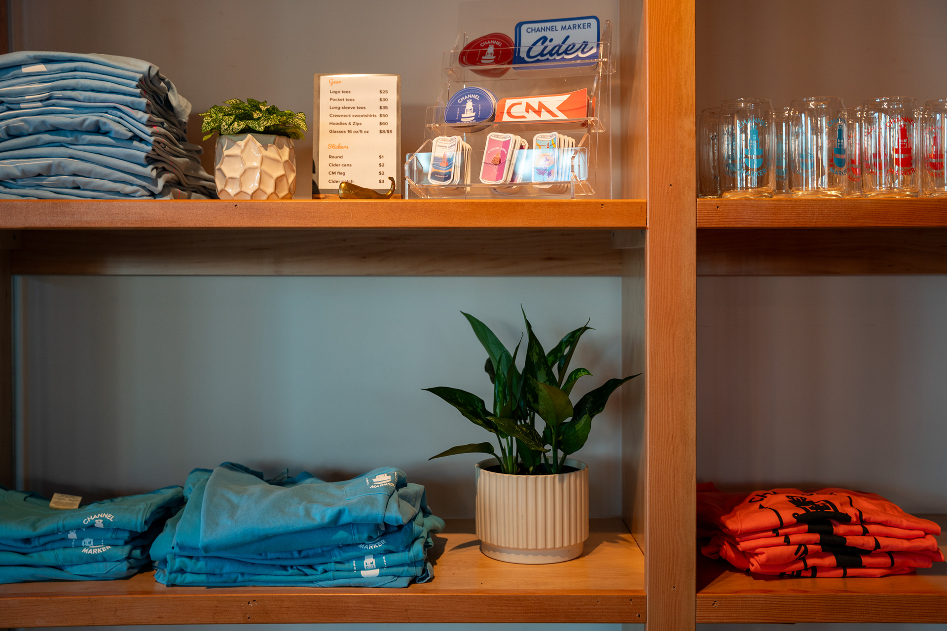
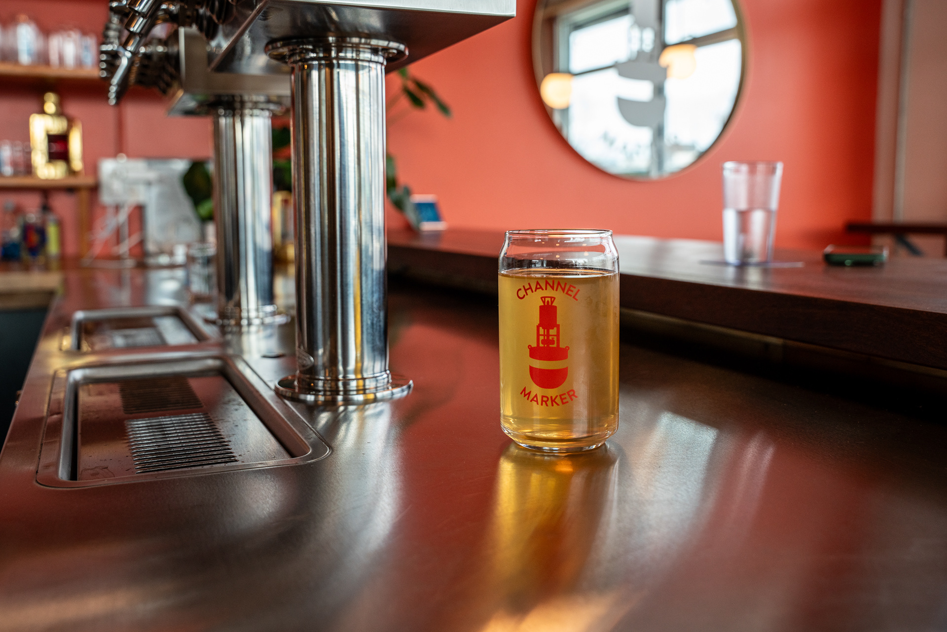
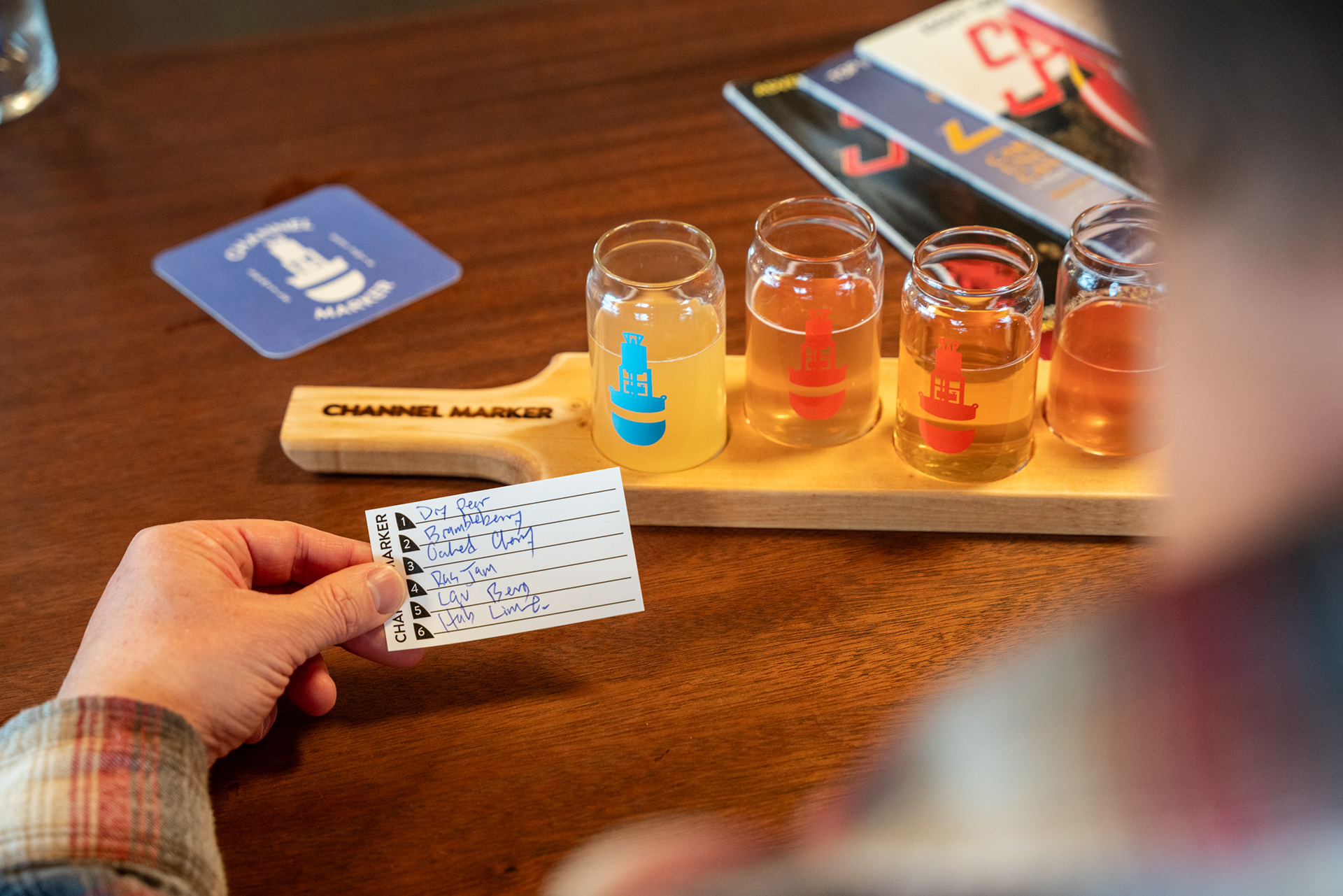
The result? A Spartan space with just the right warmth. Our signature rusty orange accent wall casts a subtle sepia glow, setting the tone for the room. Globe lights on gold bars highlight the deep richness of the Ipe wood, adding depth to the otherwise simple design. A dedicated nook for swag and cans to-go keeps things efficient, and our massive bar menu, built with interchangeable tiles on a French cleat system, ensures flexibility while looking sharp.
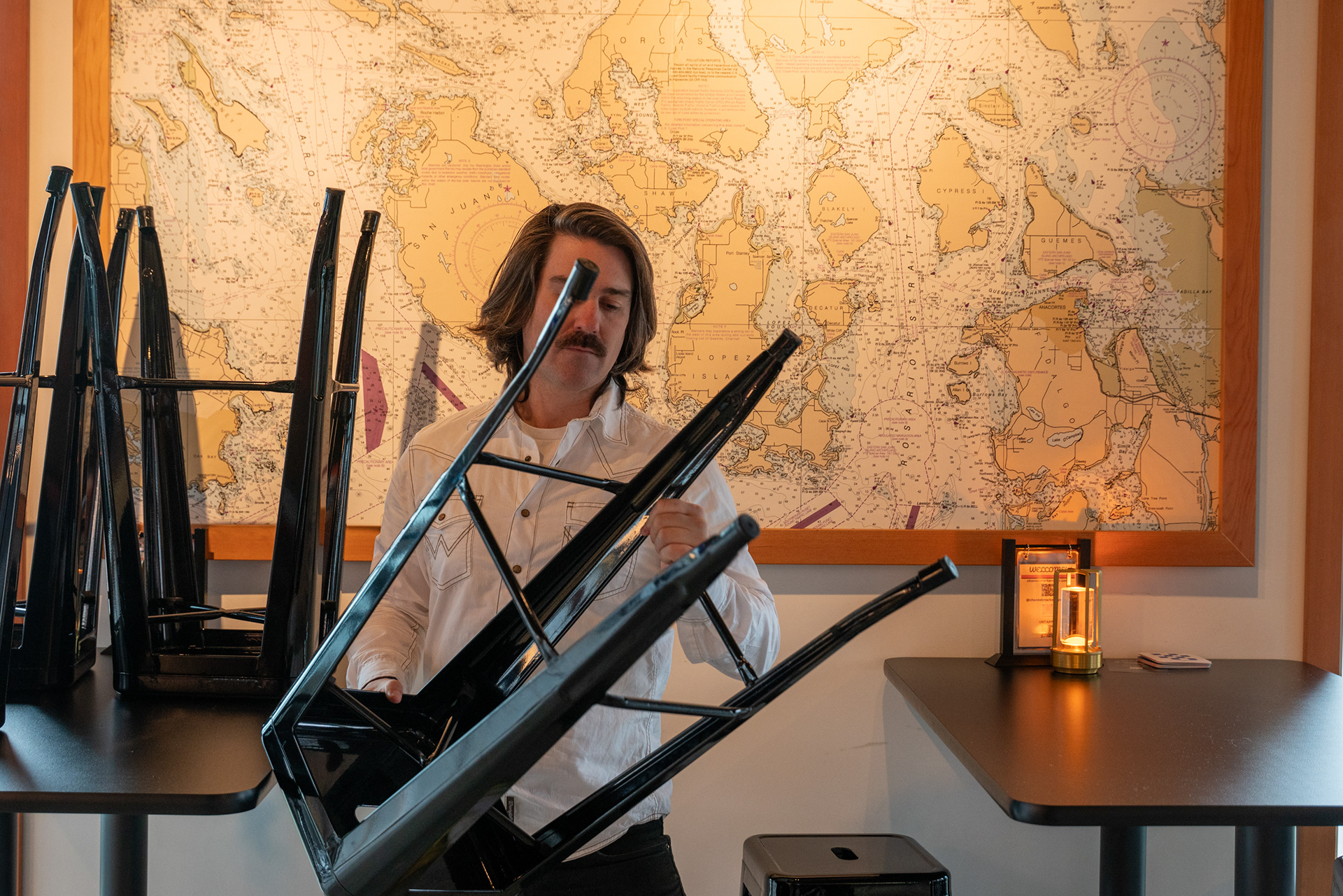
Despite the constraints, the space flows beautifully. The layout lets employees move effortlessly through the crowd, keeping the experience smooth for both staff and guests. It’s a bare-bones operation that doesn’t feel bare. We made a lot happen with very little, and in the end, I think that’s what makes it work.